Meta’s Chief Technology Officer has confirmed that they are “reworking some of the core UI infrastructure.”
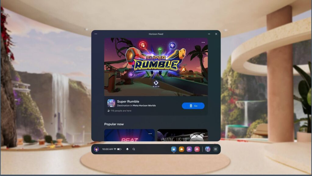
If you own an Oculus/Meta Quest device, you might have noticed how troublesome its UI and UX can be. Basic elements like button sizes, hand pointers, window movement, app resizing in tablet mode, and more are either poorly implemented or missing altogether. Users often find the Quest UI frustrating, with some considering collecting these issues on a single website. Ben Lang from RoadToVR described the experience of playing with friends in VR as a “nightmare” due to the poorly designed UI.
Andrew Bosworth, Meta’s CTO, confirmed during his Instagram AMA that the company is actively working on significant UI/UX changes.
He stated, “This is something that [was in progress] long before even Apple Vision Pro was on the scene. It is something we’ve been looking at and spending some time on and we have some pretty exciting designs and [we are] actually reworking some of the core UI infrastructure to be able to enable a richer environment.” He continues “It’s been in the works for a while and making good progress. So the answer is yes [we can expect UX/UI updates], I don’t have a timeline for you. It’s not super soon, but yeah, it’s on the way.”
Bosworth was also asked whether the three-screen limit on Quest 3 is a technical limit, to which he replied:
“It’s a good question. So the answer is no. The thing that actually controls how many PC windows we stream, in the case of this person, if you’re using workrooms, you can put three different windows up, is mostly actually the PC you’re connected to. So a three is the limit right now in terms of what we’ve built. And one of the reasons for that is not the technical capacity of the headset. It’s actually because we saw people were adding a lot more screens and their systems were suffering.”
He continues on this by saying “Having said that, it’s probably foolish and we should work on that. I think screens are obviously one of the areas that we actually can do really well. We haven’t told that story, we haven’t made it easy enough maybe for people. And so that’s something that we’re gonna follow up on and spend some time on.”
While we didn’t receive a confirmation on whether the updates will roll out gradually or as one major overhaul, or when to expect them in general, we did get a confirmation that significant changes are on the horizon, which is fantastic news. After the release of Apple Vision Pro, users were left impressed by the user interface and the ease of controlling the device with their eyes and hands. Overall, the user experience on Apple’s headset was described as far superior to that of Meta Quest.

Apple has a significant advantage in User Experience with its unified ecosystem. For example, you can copy a message on your iPhone and paste it on your Apple Vision Pro, or seamlessly connect to your Mac with a single tap. These seemingly minor features, coupled with a superbly designed UI and input method that feels almost magical, create an experience that surpasses the Quest by miles.
While Meta lacks a unified software and hardware ecosystem like Apple’s, there’s still room for improvement to enhance its competitiveness in this area. With ongoing efforts to refine both software and hardware offerings, Meta has the potential to narrow the gap between their headsets and Apple Vision Pro in terms of User Experience, and go beyond gaming in their VR/AR offerings, which they tried with Meta Quest Pro, but failed miserably mainly because of the poor design decisions.
If you want to listen to Bosworth’s entire AMA on Instagram, click here.


